Posts Tagged US economy
Japan’s lost decade
Posted by simonposullivan in Japan on August 30, 2014
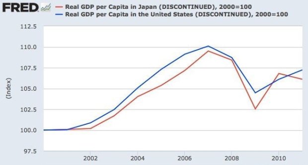
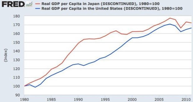
Peter St.Ongs (of Mises.org) points out in an interesting piece that when measured by GDP per capita Japan actually hasn’t done any worse than the US. The reason commentators say Japan has done so badly in comparison with the US is that they begin the measurement period in 1990 just as Japan was peaking and the US began its technology revolution:
Japan had a bubble in the 1980’s which then burst and the US had its bubble in the 1990’s and early 2000’s which burst around 2007/2008.
Still that said I think Japan long term is screwed by a combination of debt and unfavourable demographics see here, here and here for example.
Financial Stress (or not)
Posted by simonposullivan in Economics on June 27, 2014
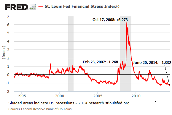
At 2007 lows again – nothing to see here, keep moving on please…..
Aggregate VaR has dropped significantly since the end of the financial crisis at the five largest U.S. banking companies with trading operations. While some of the VaR decline is a result of lower client activity and reduced bank trading risk appetite, the low-volatility environment is the primary cause of lower VaR. In a more normal volatility environment, one without sustained monetary policy accommodation by the Federal Reserve, bank VaR would be meaningfully higher. Thus, current VaR calculations may understate trading risk in the banking system.
The above is from the the Office of the Comptroller of the Currency
Syndicated leveraged loan issuance reached a record high in 2013 as the search for yield in the low interest rate environment drove an increase in risk appetite across institutional investors such as collateralized loan obligations (CLO) and retail loan funds.
Don’t these guys at St Louis Fed and OCC talk to each other?
A record $258 billion of these new covenant-lite loans are issued last year. Not just a record, but “nearly equal to the total cumulative amount issued from 1997 to 2012.”
As I said nothing to see here….
US Capex
Posted by simonposullivan in Economics on June 25, 2014
In line with my post highlighting the falling trend in US GDP growth here is a graph showing US Capex starting to roll over. Durable goods growth is about to go negative too.
h/t Zerohedge
Zerohedge make the following claim:
Even assuming 3% growth in Q2, Q3 and Q4, full year US 2014 GDP will be 1.5% – the worst since 2009
I think this validates the “QE hasn’t helped the real economy” argument. I do get/understand the counterfactual; what would have happened without QE. In truth we will never know – obviously – but I believe there has been too much monetary stimulus and not enough fiscal stimulus (which is more likely to put cash in the hands of consumers – as opposed it ending either sitting in bank reserves or being used as cheap funding by hedge funds to speculate)
US Economy Trend Growth
Posted by simonposullivan in US Economy on June 23, 2014
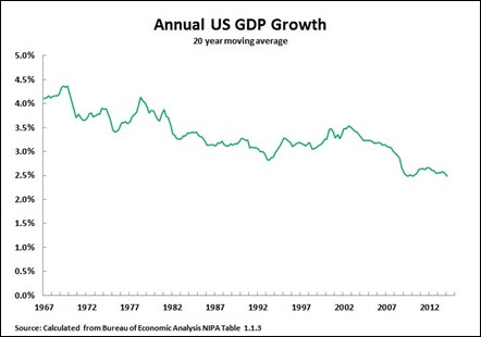
Startling decline in trend growth of the US economy. This has been going on for forty years so is not just a recent occurrence.
h/t John Ross
Shale Oil
Posted by simonposullivan in Economics on May 26, 2014
Is the shale boom in the US a mirage? I’ve read in a few places that the replacement cost of shale oil is far higher than people think (for example on oilprice.com). This seems to be confirming this:
EIA Cuts Monterey Shale Estimates on Extraction Challenges
May 21, 2014
The Energy Information Administration slashed its estimate of recoverable reserves from California’s Monterey Shale by 96 percent, saying oil from the largest U.S. formation will be harder to extract than previously anticipated.
“Not all reserves are created equal,” EIA Administrator Adam Sieminski told reporters at the Financial Times and Energy Intelligence Oil & Gas Summit in New York today. “It just turned out it’s harder to frack that reserve and get it out of the ground.”
The Monterey Shale is now estimated to hold 600 million barrels of recoverable oil, down from a 2012 projection of 13.7 billion barrels, John Staub, a liquid fuels analyst for the EIA, said in a phone interview. A 2013 study by the University of Southern California’s Global Energy Network, funded in part by industry group Western States Petroleum Association, found that developing the state’s oil resources may add as many as 2.8 million jobs and as much as $24.6 billion in tax revenues.
h/t Zerohedge
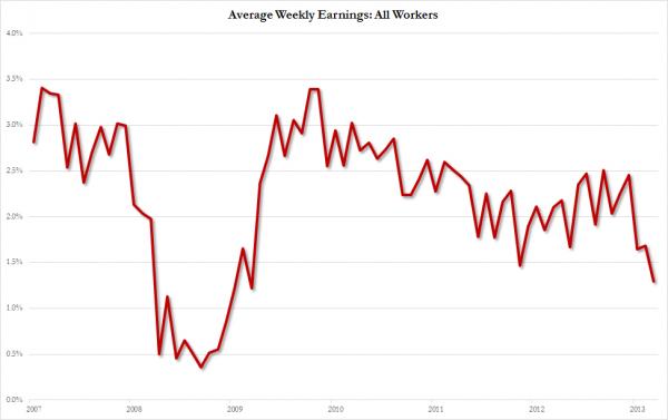
Average weekly earnings
Posted by simonposullivan in Economics on March 7, 2014
Capex
Posted by simonposullivan in US Economy on February 28, 2014
This is a rather worrying chart for those expecting a massive launch in US Investment spending (you know the “companies are sitting on a ton of cash” line – they are but they have also raised a ton of debt to take advantage of low rates so the net figure doesn’t look so hot).
Inflation
Posted by simonposullivan in Economics, US Economy on February 15, 2014
This chart nicely encapsulates why there is no inflation in the US- both the money multiplier and the velocity of money (which links M2 to nominal economic activity) are still falling (V fell 3% last year). Again further proof that QE is actually harming the US economy. US real rates are now positive and the FED has little ammunition for when (not if) things go wrong.
H/T Lacey Hunt, Hoisington Management
Loan Growth
Posted by simonposullivan in Uncategorized on January 1, 2014
Loan growth coming out of this recession has been exceptionally weak – why would banks lend when they can borrow for free and either leave the reserves sitting at the Fed and earn interest or punt on Japanese equities (or Irish property).
US Unemployment
Posted by simonposullivan in Uncategorized on November 9, 2013
Interesting stunning statistic I saw just now
In October, the number of Americans either unemployed or out of the workforce entirely came to 102.813 million. That’s an all-time high and it’s up 22.3% in 10 years.
h/t Eddy at Crossingwallstreet blog
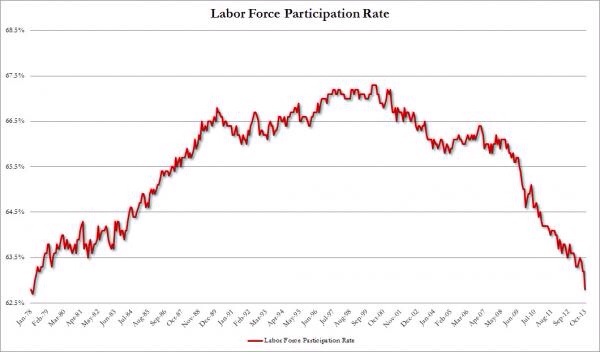
Also note the labour force participating rate is collapsing:
This explains why income is so weak- highly paid jobs (construction/ manufacturing) are being lost and replaced by lower paid jobs in retail/healthcare and education- they are less cyclical but pay less
